Author’s note: This is a map which has been floating around for a few years now. I originally posted it only on Reddit but whenever it comes up I always assumed that, at one point, I wrote a blog post explaining the map. I never actually did (not even a draft!) so this is that post. Part of the reason for this was that I was never very happy with the map. So I decided to redraw the map more in line with my original vision.
Color theory, when it comes to wayfinding, is an interesting concept but not one that seems to be talked about all that much. It’s probably due to the fact that, while different colors can make us feel a certain way, they don’t necessarily translate to wayfinding. This isn’t totally true of course; a giant red EXIT or STOP sign is pretty universal despite the fact that about 5% of the population is color-blind (more so in men than in women). When using a larger pallet of colors to give directions it becomes less intuitive. This isn’t necessarily a bad thing (once you know, you know) but it’s probably why you don’t see more color used in wayfinding outside of making signs easy to read.
This hasn’t stopped designers in the past from taking a stab at using color. In 1965 the newly created Massachusetts Bay Transportation Authority tasked the architecture firm Cambridge 7 to create a design language for their system. Previously lines were referred to by where they went, e.g. the Cambridge-Dorchester line, rather than by name or number. Cambridge 7 proposed color coordinating the lines to make them easier to understand. Green was chosen for the streetcars which ran along Boston’s Emerald Necklace parks. Blue was chosen for the subway which ran below Boston Harbor. Red was chosen for the line which went to Harvard (Harvard’s school color being crimson). And Orange was chosen… because yellow was too hard to read. Eventually this was retconned into being because Washington St, which the Orange Line runs along, was at one point known as Orange St.
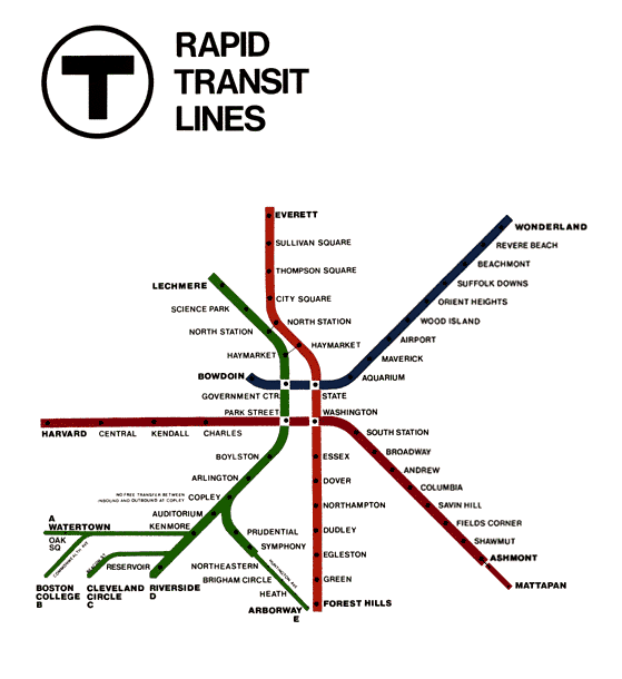
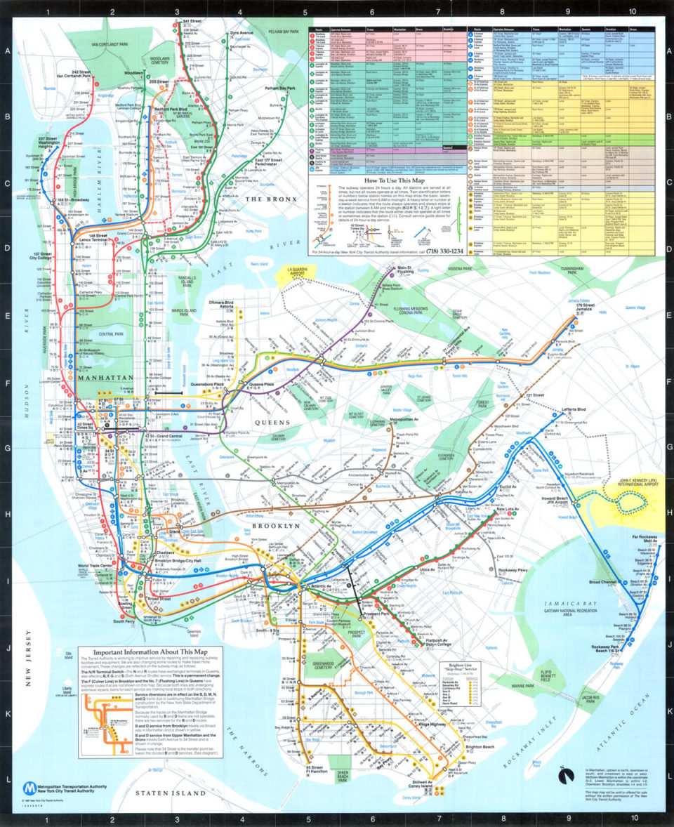
This color coding was so successful that, beyond the branches of the Green Line, if you were to ask a Boston native where to grab the Cambridge-Dorchester Line they would look at you like a tourist. Alternatively, you can spot a Boston tourist (or any tourist really) in a city like New York when they misidentify the 4 train as the Green Line. Interestingly, the color coded naming system did not catch on in New York. The complexity of the system meant that any one trunk line would have trains which ran to many different locations.
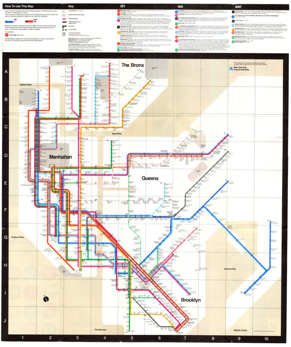
When Massimo Vignelli designed his infamous subway map he chose not to color code the trains by trunk line, as is done today, but have each train a different color. This required duplicating colors so that a Green Line could mean two or more different trains entirely. This was eventually simplified when the Manhattan trunk lines were color coded which made traveling into the city easier. We might not call it the Blue Line but every New Yorker knows the A/C/E runs up 8th Ave (and not to the Bronx).
One of the lesser known color changes Cambridge 7 added to the MBTA was inside stations. Cambridge 7 recommended cleaning up platforms by building false walls at either ends to obscure infrastructure which had been added over the years (pipes, wires, etc.) These walls were then painted in alternating stripes of either Red and Green or Blue and Orange. These weren’t just to cement the new line colors into the system. Red and Green walls indicated that this end of the platform pointed towards downtown Boston while Blue and Orange indicated trains would be heading to their suburban terminus.
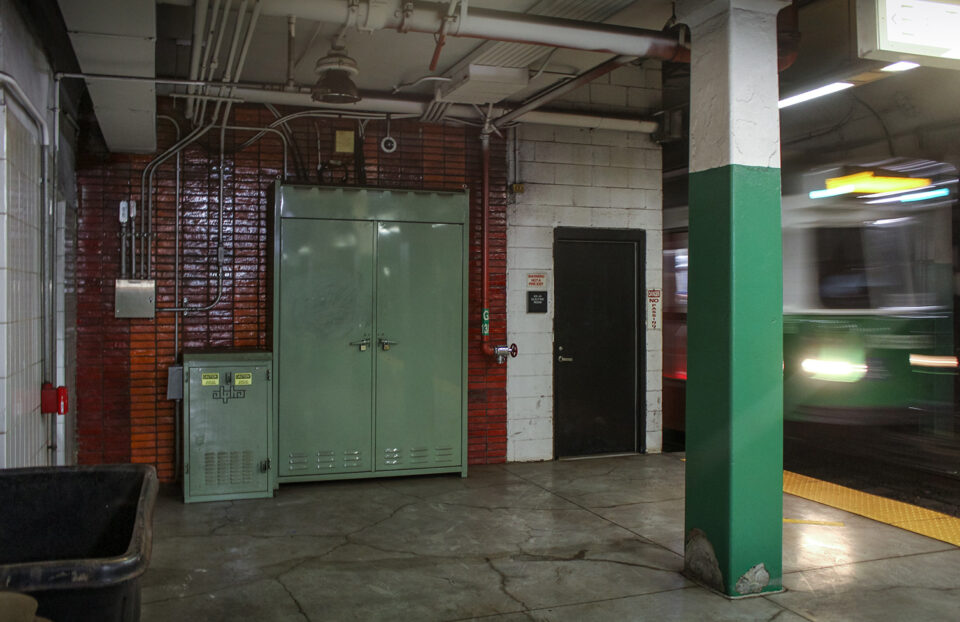
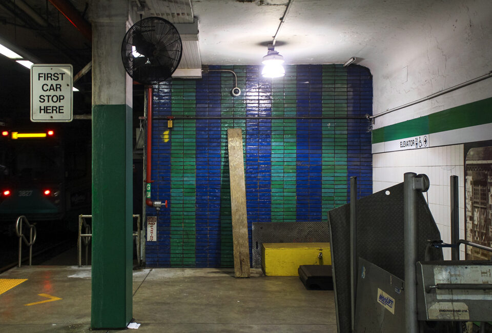
I can’t speak to how well this works since I have grown up being able to read subway signage pretty well. Even so, when in a hurry, the most seasoned strap hanger can often get turned around in the underground labyrinth and come out onto a subway platform not knowing which side they are on. Since we instinctively look down the tracks to see if there is an approaching train it would stand to reason that we would be also staring at the color coded end wall of the platform and realize which direction we were looking.
I suppose the usefulness of this system is long gone thanks to the advent of countdown clocks showing which trains will see be arriving. It probably also doesn’t help that, due to poor maintenance, these colored walls are either faded or not lit properly and therefor hard to see. I think most riders probably just think they are there for decoration and wouldn’t guess their true purpose.
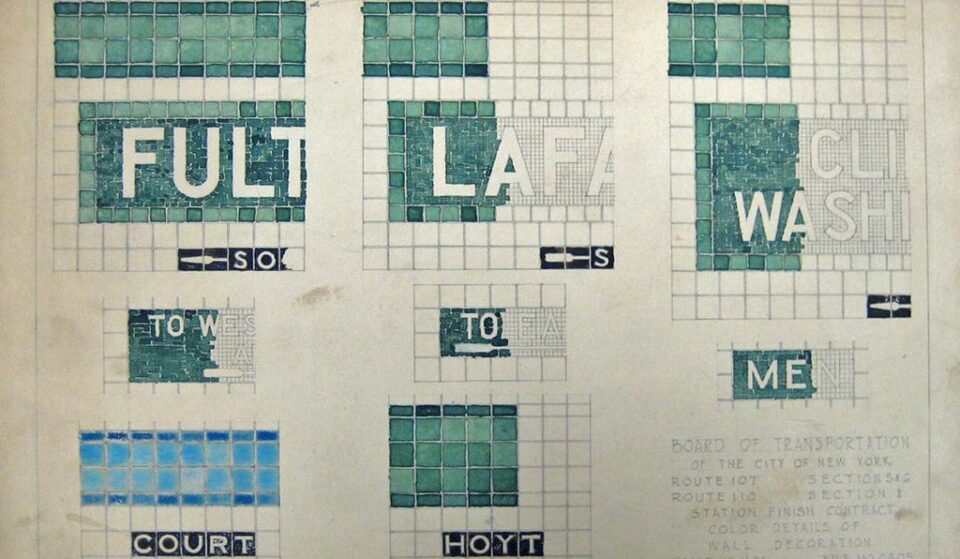
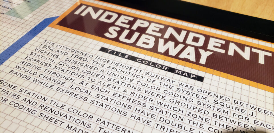
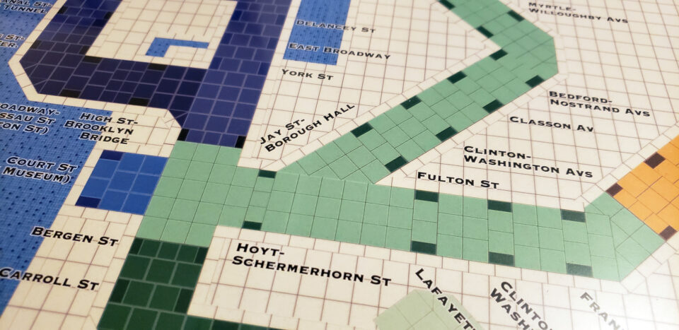
A similar attempt at color coded wayfinding was made in the 1930s by the architect/designer of the New York subways, Squire J Vickers (that is to say, he designed the station elements and signage, not designed the subway routes themselves). Vickers had designed many of the mosaic station tiles which line every subway station. The IRT often had terracotta station emblems which showed off a piece of interesting history at each station, such as the beavers at Astor Pl. (John J Astor made his original fortune in beaver pelts). As the system expanded and tastes changed, Vickers modernized his mosaics into more abstract and geometric designs. These are most often seen on the BMT lines.
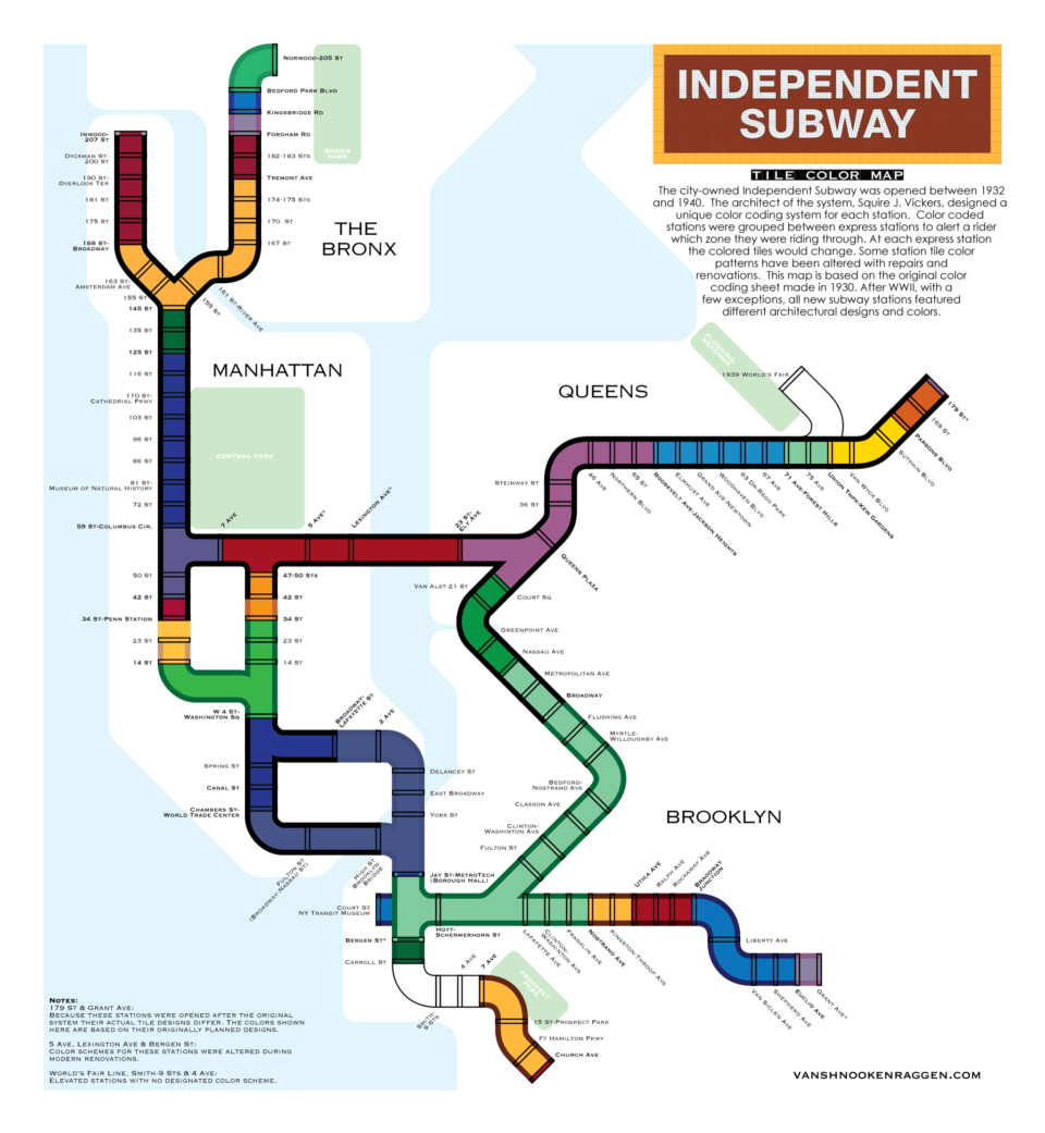
When the city embarked on their own, independent subway, Vickers chose to dive deeper into the art deco modernism of the day. Gone were purely decorative designs, in were stripped down and streamlined bold colors. Vickers developed a system for the new subway network which would help the rider navigate by color. This was especially important for a city full of new immigrants who may not speak English and be able to read station signage.
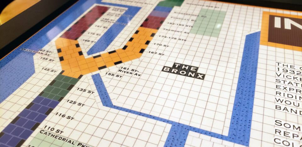
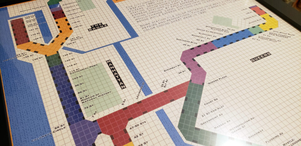
Vickers’ system was brilliant in its simplicity. Subway stations would be grouped by express station zone. At an express station a new color code would start and each local station along the line would keep that color code until the next express station. This ensured that if a rider missed their stop they would at least be close enough to ride back or walk.
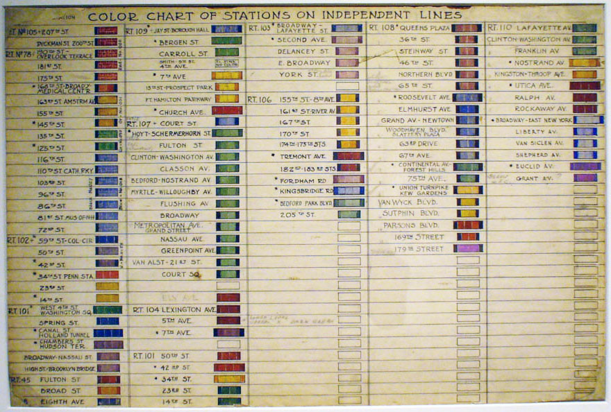
Express stations would feature a colored tile band three tiles wide with half tiles of a different (although sometimes the same) color. Local stations would have a two-tile wide band with border tiles. The station names would be mosaics in the same color code. Due to the slight color changes in tile production these mosaics would feel more textured rather than be large blocks of color.
While Vickers developed a style guide, often tiles have been changed over the years due to the fact that it’s just cheaper to order a lot of tiles the same color. While tiles of the main color of each section are often kept, the border colors have been replaced with standard black tiles throughout the system. Some tile bands have been replaced all together (as in the case of the terrible post-modern 34th St-Herald Sq station) and some have been installed incorrectly (such as at 15th St-Prospect Park which is a local station but has three-tile wide bands reserved for express stops.)
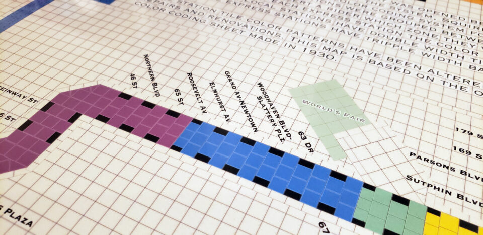
Other design choices are worth pointing out. The IND Crosstown Line (G train) is only local and has no express stations. It still features three distinct zones: Hoyt-Schermerhorn to Flushing Av, Broadway and Metropolitan Av, and Nassau to Court Sq. The changes are subtle but present. My speculation is that this is based on the fact that at Metropolitan Av you can transfer to the L train to Manhattan and that, had the South 4th St Subway been built, you could have also transferred at Broadway to Manhattan trains. This color zone indicates where you can transfer and where you can’t.
Two stations which could have seen different color zones but did not are Bedford-Nostrand on the Crosstown Line and Woodhaven Blvd on the IND Queens Blvd Line. Bedford-Nostrand was built with provisions for a branch to continue east down Lafayette Ave. This would have made it a logical station at which to change color zones. The Woodhaven Blvd station was built as a local stop but has provisions in the tunnel walls for a possible expansion into an express stop. This, too, would have meant a color zone change. Interestingly, a late change to the system was included in the color zone: the Nostrand Av station on IND Fulton St Line was originally a local station and while under construction was converted into an express stop. The color bands on the next two stations were changed accordingly.
A small detail from Vickers’ color code, which I’ve not included on my map, is that non IND stations were built as part of the original IND system expansion. The BMT had wanted to extend the Centre St Subway (J/Z train) south along Nassau St and Broad St to link up with its Montague St Tunnel, but the city dragged their feet on giving them the go ahead. Likewise, as a new trunk subway line was being built on 8th Ave, the BMT also wanted to extend their 14th St-Canarsie Line (L train) from its current terminal at 6th Ave to the new subway. These extensions were built alongside the IND and Vickers designed color codes for the new stations to be built. Ultimately, he chose to stick with the older BMT mosaics instead.
Most of the post-War subway expansion left Vickers color system to the annals of time. While the 179th St station on the IND Hillside Ave Line was built with its original intended color bands, this was changed to a snaking blue and orange band reminiscent of a Sven Lukin instillation. The IND Fulton St Line extension to Euclid Av had been planned and partially built before World War II, so it stands to reason that the tiles were already designed. The Euclid Av station keeps to the original color code but has more modernized tile designs. When the city built the 63rd St Tunnel it went with contemporary designs for the new stations. The Archer Ave Subway was built with a brutalist cave design and the 2nd Ave Subway stations were lined with large, horizontal white tiles.
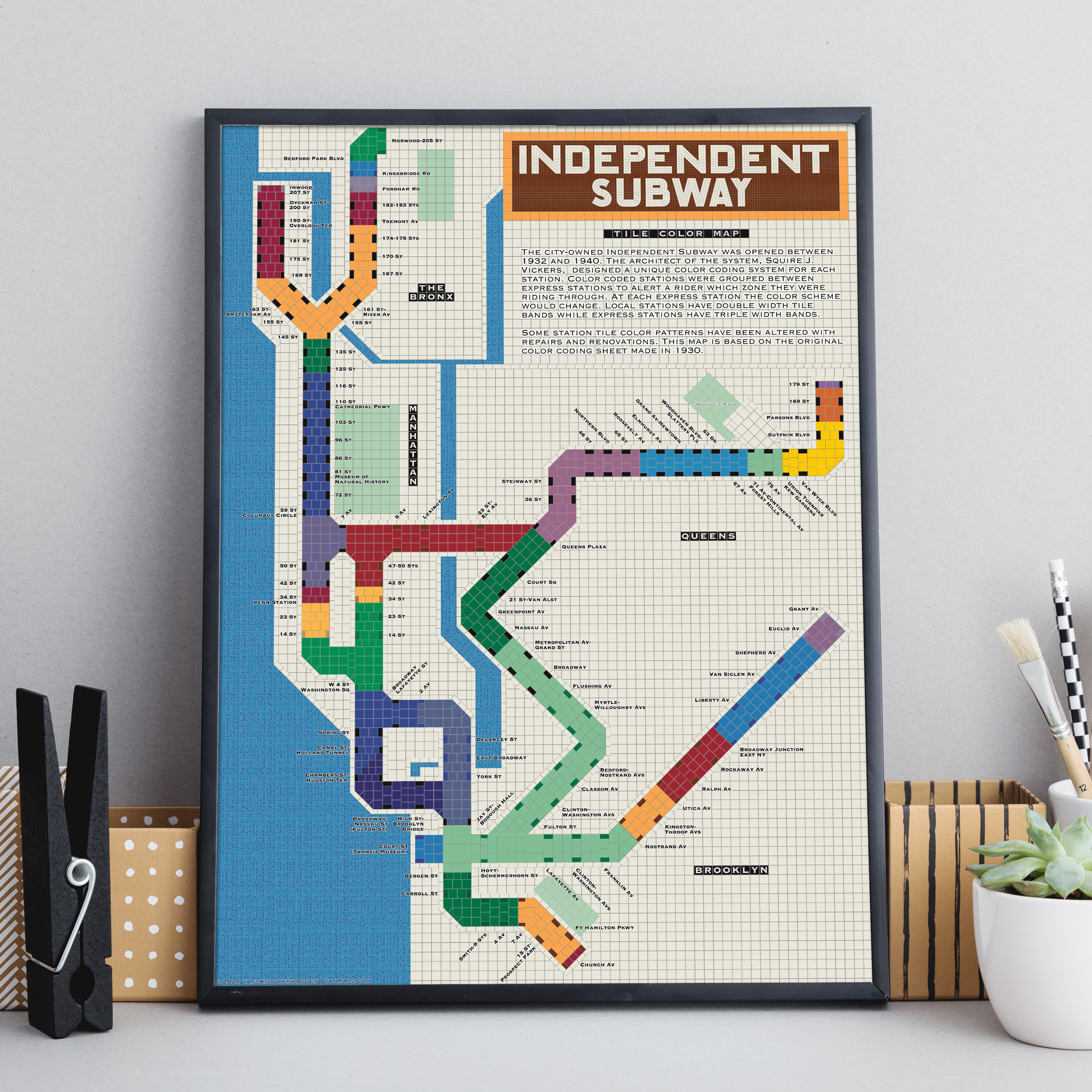
Like the Cambridge 7 design, Vickers subtle color code is largely forgotten today. I decided that it might be fun to visualize the subway map not as a piece of transportation wayfinding but rather as the mosaic of tiles Vickers had in his head. My original map from a few years ago, which has been floating around the internet, showed off the color pallet but didn’t invoke the tile design which I had in my head. This new map shows off the subtleties of the color pallet better , as well as the differences in the express and local tile band design. Unfortunately the original test patters and color charts are somewhere deep in the New York Transit Museum archives which are closed due to Covid-19. The digital versions I’ve found online are often low resolution, so the colors I’ve chosen are rough approximations.