
When I was 18 I was a freshman studying Industrial Design at Wentworth Institute of Technology in Boston. Sitting in my Intro to Design lecture the professor was going through a series of influential designs from the 20th Century when the 1972 Massimo Vignelli NYC Subway map came up. The professor went on and on about how revolutionary it was but, being the first time I had ever seen the map, all I could think was what an beautiful failure it was.
Vignelli and his company, Unimark, had a clear goal and ethos when they set out to redesign how New Yorkers use the subway. Years of different signage had cluttered the system so that trying to navigate it was difficult even for a seasoned rider. A uniform visual language was drawn up that featured bright color dots with easy to read train lines and quick text blocks that explained which service was running on which track and when. This language is still in use today and has become a trademark of the system.
With this new system came the need for a clearer map as well. Subway maps up until this time mainly showed the rider which trunk line was being served. By that I mean which main line in Manhattan, so instead of the R train you had the Astoria Line via Broadway and the tunnel to Bay Ridge. This didn’t allow for part time service or night time service changes.
Before we go on a distinction needs to be made.
This is a map:
This is NOT a map. This is a diagram:
The difference is that a map is a scaled down geographic reference while a diagram distorts or eliminated the geography to show some element more clearly. Henry Beck was the first to do this for the London Underground map in 1933. In places like lower Manhattan stations are crowded together while in the outer boroughs stations are spread further out. A geographic map would both be too cramped to read and have too much wasted space. A diagram which distorts geography thus makes understanding how to navigate the subway much clearer.
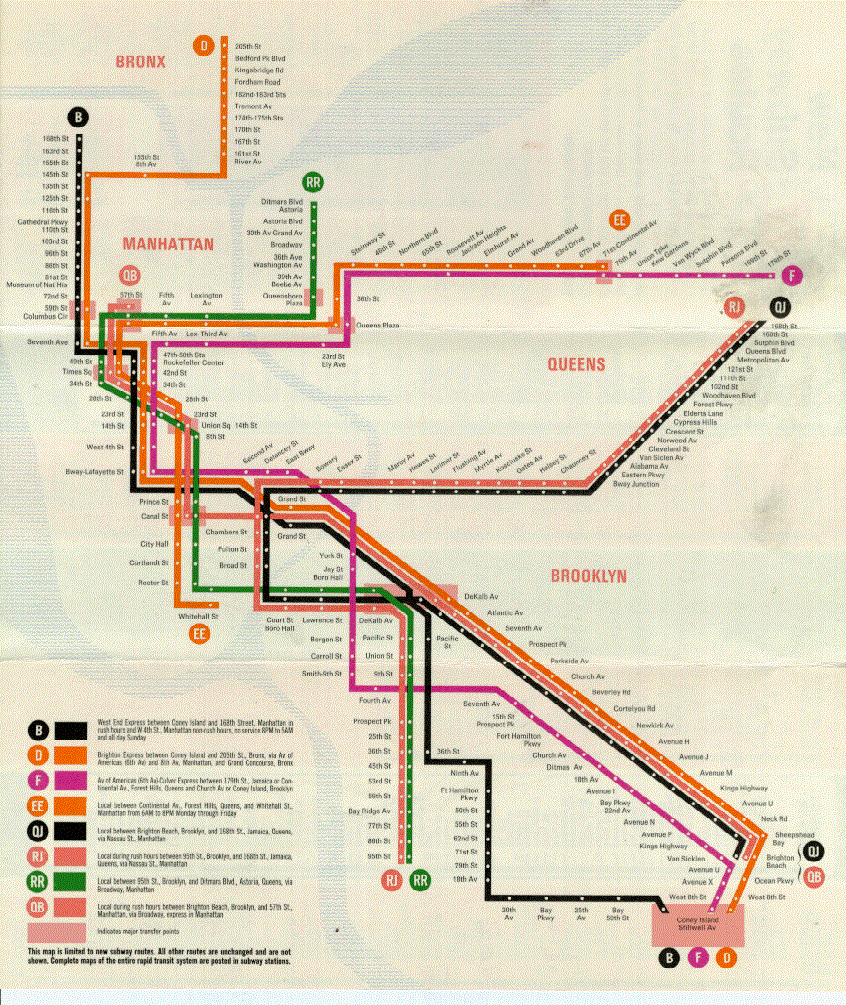
Vignelli knew this and made a radical leap in terms of design. Each train service now was labeled and color coded so that it could be easily traced. Keeping with his modernist traditions of “form follows function” the geographic display of the city form was added after the main diagram. The biggest stand outs to this alteration is now Central Park, a 2.5 mile long green rectangle, is shown as a gray square.
Sure, change is hard, but what riders at the time and I at 18 seeing it for the first time both felt was that the point of the map had been missed. Vignelli is on record saying that he felt that his map was only for a rider to navigate from Point A to Point B within the system. This was, and is the most important use for any subway map.
But this single-minded approach belies the fact that if a rider is using the subway as their main mode of transportation then it is only the middle part of a total trip. A rider must first get to the subway station, usually walking or biking (or park-and-rides for more suburban systems), and then when they exit must continue the same way to their final destination. Distorting and eliminating the underlying geography of the city means that the subway map is only partially helpful.
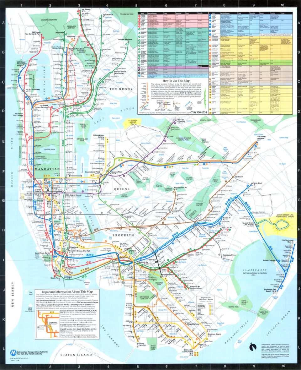
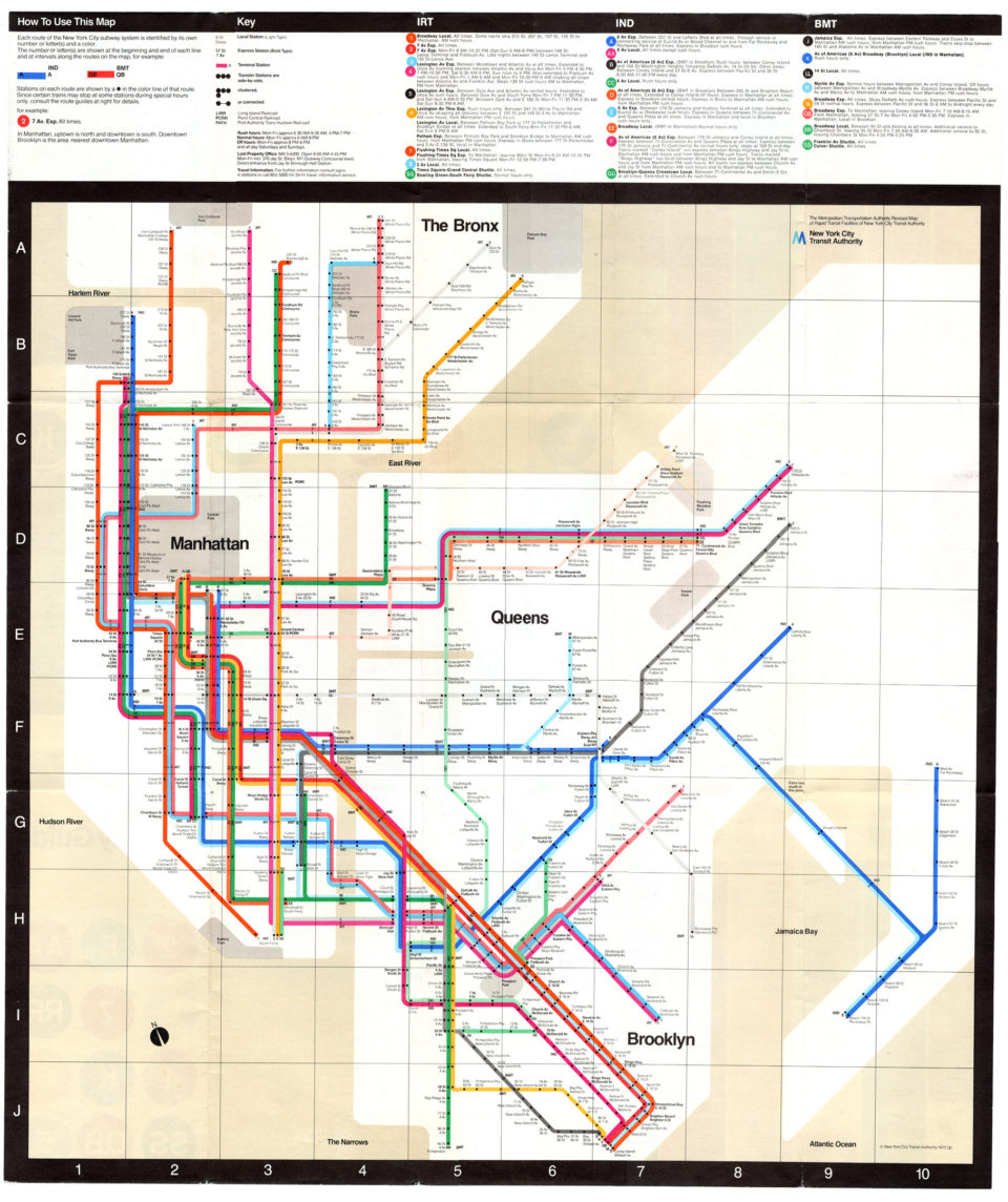
The Vignelli map only lasted 7 years before it was replaced with the predecessor to our modern “The Map“. This map left the hard angles and blank geography behind and went with a vernacular that was more light hearted, with lines flowing around the city and major streets added. And Central Park was a green rectangle! But even here much of the street grid and major destinations were left out. Clarity of the system took precedent. Cartographers still tinker with ways of finding the perfect balance between clear communication and geographic location.
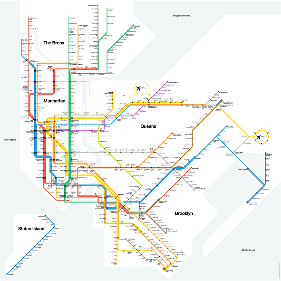
In 2008 Vignelli was approached by Esquire Magazine to update his iconic map to be more contemporary. The basic design language of 45 and 90 degree turns was kept but the color scheme was greatly simplified along the lines of the modern map. What was left is arguably the most perfect subway diagrams ever made. His original concept was close but it wasn’t all the way there. Still, the updated map, soon picked up by the MTA and used for their Weekender service changes website, didn’t show proper geography. It also wasn’t well suited for the roll into which it was placed. The Weekender was intended to show service changes but the simplicity of the Vignelli map was unable to show the complexity of the subway network and how often trains are rerouted.
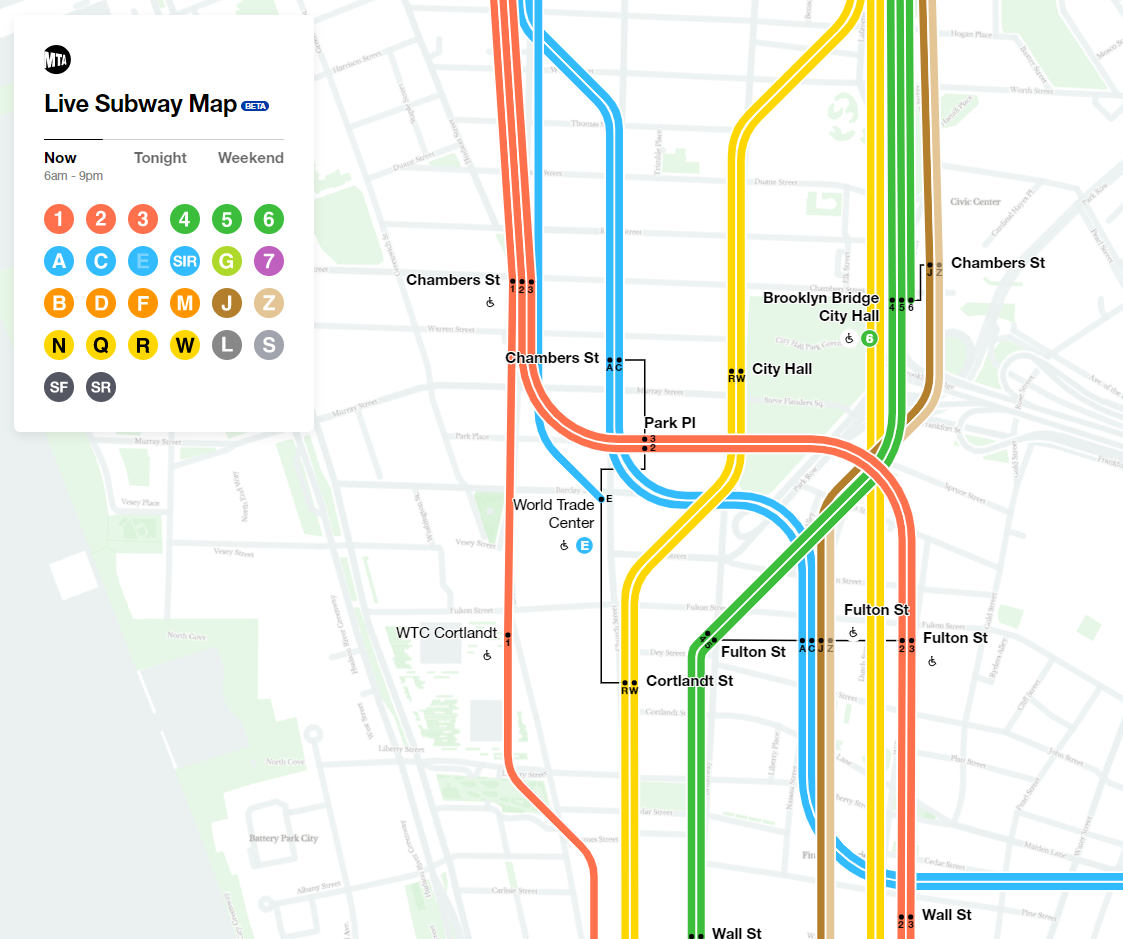
Enter the MTA Live Subway Map.

The goals of the brand new (and still in beta) map are laudable: with technology we no longer are constrained to simple, static paper maps and can instead have dynamic maps which show different aspects as the users navigates the map. I am not a coder but this is something I’ve been dreaming of for a long time. Google Maps has been pretty good at doing this as a user can zoom into a building and see different levels within.
The idea was simple: combine the clean design of the Vignelli map with the real geography of the city so that a rider can zoom in and out to fine tune their route.
The result: the worst of both worlds. The new Live Map isn’t a bad idea, it’s just a terrible execution. It has just missed the mark and is half baked; it needs to go back in the oven.
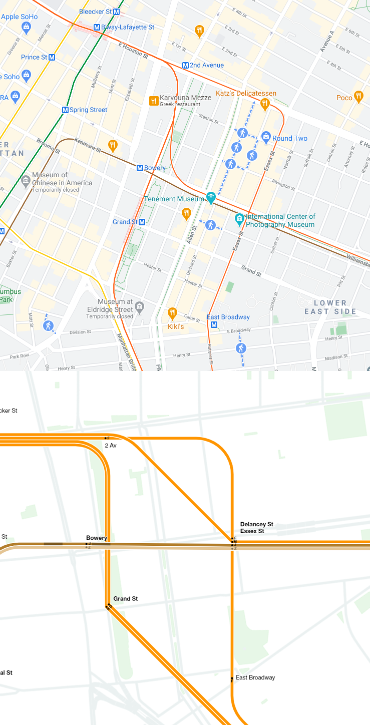
Bottom: Screenshot of the MTA Live Map showing Lower East side with lines divorced from the geographic map below.
What is the purpose of having a geographic map base when the subway diagram isn’t going to adhere to it? It’s obvious the coders started with station GIS data and tried to have a computer draw the connecting lines. Google used to do this and things just looked wrong with lines traveling to places they never actually went. Eventually they aligned their lines to their proper course.
But what the… “designers”… did here was go one more step down the rabbit hole and instead try to connect each station with lines more in keeping with the Vignelli scheme. Tried to is really a stretch because none of the curves and angles actually are in keeping with the Vignelli vernacular. This is obvious since you the diagram and map cannot exist in the same geometry. But even worse is the fact that it looks like the designers chose to draw certain subway lines in the wrong places for no particular reason with curves in seemingly random locations.
A map, or diagram, is supposed to get a user from Point A to Point B. This map does that in a basic sense and then throws everything else out for vanity. At least Vignelli had an ethos. The Live Map takes that ethos and strangles it.
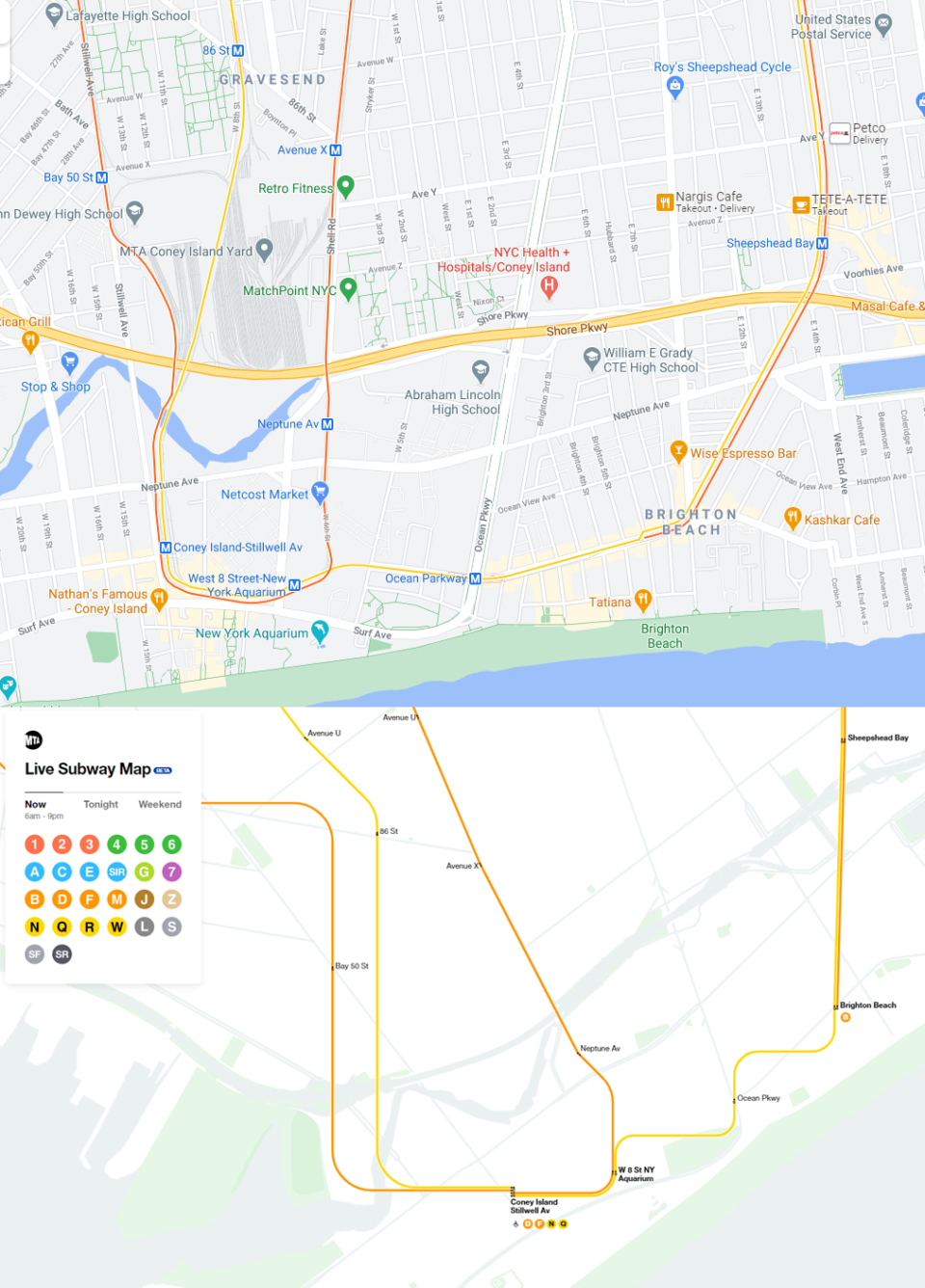
Bottom: Screenshot of MTA Live Map at Coney Island.
One might argue that this is a computer algorithm drawing the subway. But that doesn’t take into account things like this roller coaster down in Brighton Beach or how the N and Q trains have been rerouted through a brand new subway tunnel under the East River as opposed to taking the Manhattan Bridge. No, these were choices. Choices made by adults who were paid real money to make this. Instead we have something that a 3 year old would draw and for a parent to display on their fridge.
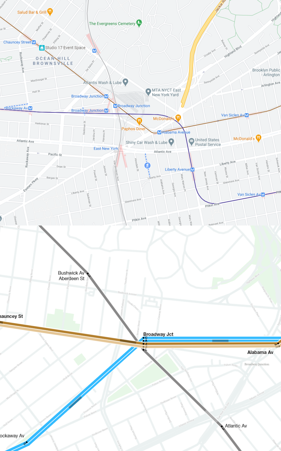
Bottom: Screenshot of MTA Live Map at Broadway Junction.
Look, I’m no perfect cartographer. This blog wasn’t started so I could claim any sort of expertise but rather a showcase for my journey. Hell, the very first attempt I ever made at making a full subway map was this abomination which I was, rightfully, ridiculed for. I learned and grew. I also drew a lot of maps using the Vignelli map as a base and I became more understanding and respectful of the designer I once dismissed years ago.
The Live Map is a great step and the MTA and NYCT doesn’t get enough credit when they try to do the right thing. But it needs so much more work. All that I am asking for is to throw out the idea that you need to meld the two ideas together (or as I put on twitter, as if David Cronenberg designed a map).
The basic failing of this map is that it is trying to be two polar opposite things at the same time. The reason we have subway diagrams is that we couldn’t have perfect subway maps. But with technology we don’t need a hybrid of the two. Draw the geographic map with the clear, clean lines but along the routes they really go. Then add in bus stops, commuter rail, PATH (!), and all other transit. Put those on layers that can be switched on and off. Showing just the subway is a waste when we have the technology to create a custom experience for each user.
Many online are praising the map and I totally understand that there are people out there who have no idea what my problem with it is. It’s ok, I’m overly educated. But if you are going to go to the trouble and expense, just get it right. This was obviously a rush job and what is so disappointing is the PR blitz the MTA did this morning showing the map off. The headlines read “the great map debate is settled” like anyone who had anything to do with this knows what that means. This product isn’t ready and I don’t know if they know that or care. What’s more insulting is that there are other designers out there who have already done this basic idea. This didn’t have to be done so poorly.
My favorite NYC Subway map (other than your track map of course) is the Apple Maps transit layer. Both clean and geographically accurate. It even shows the entrances, exits, and concourses for the stations.
Like, the MTA didn’t need to do this in house. It was literally rushed to prove they can get (something?) done!
Worse, they didn’t do it in-house.
Some aspects of the line drawing reminded me of your track map (which is my favorite). It would obviously be improved by being a track map (which it sometimes looks like when there’s multiple lines on the same trunk) so both directions wouldn’t be on the same line drawing (takes time to see which way it’s going), though you would have to have a way to distinguish trains of different lines on the same track. You could just show the route bullet next to it.
So I would love to see your map used for this.You should really approach them with the idea!
The other problem with the Live Map is how it gets its information. I forget all the technical info, but it sucks up massive computer power to it. I have a 2019 iMac with an i9 CPU and 64gb of RAM and the CPU usage spike to over 75%, the CPU temp went to almost 160 degrees, and the fan went right to 100%. So this a great idea, but needs more work.
So true. I very much agree with you on all aspects you cite. Additionally, the whole UI is choppy as heck. It’s built on React as well. They did not even nail the simple things there either. However, I also question the whole tech stack. They could have gone with React for sure, but I think choosing not a map, but a diagram base for the map layer would have been wiser.